Designers and Prepress Checklist
By Steven Strooh, RMX Network
The best way to ensure an efficient design-to-print process is for the PSP and their design client to work together. Both parties should be involved in each project step, from idea generation to printing.
Many clients, unfortunately, assume that prepress and printing should be handled exclusively by the technicians at the print shop. This is a mistake!
The danger of having someone without a design background make modifications to a designer's file is that it can result in unwanted design modifications that undermine the overall effect of the intended layout. It is vital to ensure nothing gets lost in translation between the designer’s desktop and the print shop. To this end, encourage the designer to follow these step-by-step prepress examinations of their design files. It can save them (and you) time and a batch of headaches. It can also save a ton of money! Many of these steps are already performed by designers internally but seldom do the steps involve the PSP.
Considering that according to large-volume print production expert Allen Glazer, 25-75% of a design project’s budget involves printing costs, mistakes in prepress can be very costly to fix down the line.
Preparing graphic design files for printing can be quick and easy once the designer knows what elements to look for. To allow the PSPs to do their best work when it comes time to print, here is a prepress checklist that covers everything designers need to look for when finalizing a proof. It incorporates everything from simple editing to advanced technical procedures. And, of course, both the designer and PSP should be involved. Here’s a checklist to help get you started:
1. Proofreading
Minor oversights, such as typos and grammatical errors, can differentiate between closing a sale and a customer choosing the competition. A poll from Standing Dog Interactive found that only 3 percent of people didn’t mind errors. In contrast, most consider typos and grammar mistakes a deciding factor in whether to continue reading… or not. “Negative web user experiences hurt sales,” they write, “and the findings in this sampling indicate that typos and grammatical errors will likely cause a major segment of a company’s potential customers to have a negative experience on its website.”
Catching errors is even more critical when you’re printing. Once the design is output and in the hands of their customers, it is too late. Now the customer is doing quality control, which is never good.
You'll need to address two types of proofreading before sending a file to print. Linguistic proofreading covers what most people associate with editing: checking for grammar mistakes, typos, spelling, and the overall flow of the language used in the ad.
Prepress proofreading (or graphic proofreading) touches on the visual appeal of the text from a graphical standpoint. Look for splitting words at the end of line breaks, the length of lines, and even text spacing. The biggest thing to be aware of is maintaining consistent line lengths when breaking sentences. Longer or shorter lines stand out and can throw off the general uniformity in a block of text if not spaced properly.
2. Font spacing
Once the proofreading is finished, it’s time to set the text spacing. Most fonts and design programs come out of the box with some degree of optimization, but not adjusting fonts using visual judgment will often leave them looking a little off.
Classic typography procedures like adjusting your text's leading, tracking, and kerning are central to creating the unique look needed to make the design stand out.
Think of the entire image as a composition: each punctuation mark, letter, block of negative space, and paragraph must work cohesively with the others to create a seamless experience for the viewer of your design.
3. Image size and resolution
Double check the resolution of the imagery before printing. This means noting the resolution of photos in the design and the resolution at which the whole final draft is saved.
Wide format print items should be saved at between 100 and 200 DPI. Many clients need to be warned against the advice often given about resolution. An example is what Sara Duane-Gladden at SpeckyBoy suggests “A good rule of thumb: always save the design files at the highest resolution possible. Though you can scale an image down if you must, it is impossible to add pixels after the fact.” Although this can be true, it is much more common that PSPs are inundated with humongous files that have an unnecessarily high DPI. These large files take time to transfer electronically and to move across an internal network.
Take, for example, a recent situation that happened to an RMX partner. The designer wanted a hundred dimensional printed on a rigid substrate. The client built the CMYK files at 300 DPI at 8”x12”. This was a total of 3.3GB and suitable for printing at 300% or 24”x36”! However, the customer only wanted them 4”x6”. The files only needed to be less than 94MB combined!
In this case, if the designer and PSP were working together, they could both have saved time and money.
Interpolation: Generally, designers should be encouraged to never enlarge or interpolate photos in Photoshop. This is best left to the prepress technicians at the PSP. They have specialized software like Topaz AI and RIPS that are much better at interpolation. If the enlargement is considered, it should never be more than 20 percent of its original size.
It is important to remember that resizing images in the document changes the output resolution of the image in the document. This is easily checked in the Links panel. It is crucial when creating wide format posters or banners with photo-quality images.
Again, remind the designers that 100DPI is often sufficient.
4. Color accuracy (CMYK vs. RGB)
When printing design files, what is seen on screen is often not what the printer outputs. One way to ensure that what is seen on the screen looks similar to what comes out of the printer is to check the settings for the color mode of the design.
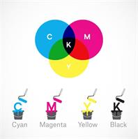
Computer monitors and digital cameras view color and light in different spectrums than printers do, and failing to sync the two will reflect horribly in the printed output. Electronics that produce visual light or interpret it via a sensor use the RGB spectrum to make colors because that is how colors made with light work. Colors made with ink use CMYK colors.
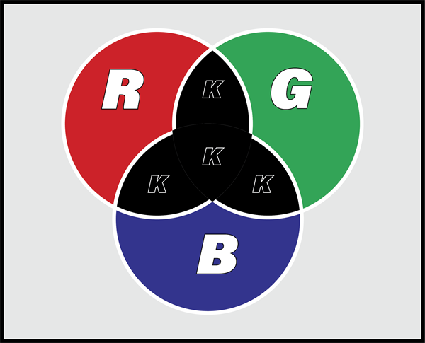
Many design software programs use the RGB color mode (sRGB) by default since the assumption is that most designers are designing for online delivery (websites, social media, video). Printers, however, use a CMYK process to create a full range of colors. This additive process—as opposed to the subtractive RGB system—involves overlaying color inks to create deeper colors on the way to black. RGB, on the other hand, subtracts the other two colors when overlayed on top of each other. However, in the case of transmitted light, the overlapping colors produce a mix of colors, with all three yielding white. If overlapped in a printing process, Red only allows red light to pass through and blocks Green and Blue. Similarly, Green blocks Red and Blue while Blue blocks Red and Green. Consequently, overlapping two RGB colors will result in Black because all the light will be blocked.
The primary takeaway: if the designer’s computer and the printer aren’t speaking the same color language, the results will not come out right. So the designer must set the program to the CMYK color space. The preferred space these days is Coated GRACol 2006 or U.S. Web Coated (SWOP) v2.
5. Calibrate the monitors
Another way to ensure color accuracy is to calibrate monitors before printing the design. When printing mock-up drafts, the colors seen on-screen will differ from the printed colors if the monitor is inaccurate.
Graphic designers and photographers have a range of tools to check the color accuracy of their images before sending a design off to the press. Making sure the imagery color space is correct before the designer sends them to the press can save you a lot of money in misprints.
An image can look very different on differently calibrated monitors.
It’s important to realize that customers and designers may have their monitors calibrated differently, which could lead to issues in communication. It’s best to view a design on a properly calibrated monitor or a properly profiled wide-gamut output device like a photo printer on a photo media. Caution: While we expect these colors to be ‘visually similar’ to those on-screen or in the color swatch book, we never talk about colors ‘matching.’ Designers can expect that given appropriately color-managed files, a PSP will print the best possible colors given the limitations of a device and the media being printed. By printing the file, the designer may see subtle differences in color not noticed on their monitor.
6. Define the bleed and crop marks
Taking design files from the digital realm to the physical involves ensuring the file’s bleed, crop, and cuts are correctly created. These marks indicate the edges of the design and where cuts should be made once things are printed. Here again, discussions between designer and prepress are necessary to determine how the PSP’s systems want cut files named and how much bleed should be created. The bleed varies depending on how the banner, poster, or wallcovering will be finished.
Crop marks indicate where your design will be cut, and the bleed is where parts of text or objects extend past the page boundary to compensate for trimming.
7. Create a high-resolution PDF
Once you’ve gone through every step, it’s time to save your proof. PDF files are mostly lossless printable file formats perfect for just this purpose. Once you’ve saved everything in a PDF, you’re ready!
8. Select the printer and media
It is essential to discuss what output is required and which device and media combination will be used.
Different types of media create a different feel and visual appeal than others. For example, scrim vinyl may be cheaper than a smooth polypropylene media, but the finish and colors will be markedly different. Similarly, with the output device. Spend a little time considering which output combination is best suited to the expected appearance of the finished product and the cost before printing.
Summary
Going through prepress and pre-flighting, looking for red flags helps preserve the integrity of the design from concept to final print, so nothing gets lost in translation. Prepress helps catch the little mistakes that become big when they find their way to the print shop—errors that immediately render hours’ worth of thought and design moot. With only a couple of quick steps, money and time can be saved, while the work produced is up to the highest industry standards every time.